Blog  |   Puzzles  |   Books  |   About

Facebook and gender-bias in names

September 13th, 2010

Some weeks back, I used Facebook’s open graph API to read about 1.2 million names from Facebook users. I used it to construct this file, which shows, for each name, the number of times it occurs, the number of times it’s used by males, and the number of times it occurs in females. To keep things simple, I’ve included all locales, although the gender bias does differ a bit depending on locale.

As you can see from the first few names in the list, most first names have a strong male or female bias on Facebook.

“Michael”,13937,13905,32
“Chris”,13384,13254,130
“Matt”,12996,12996,0
“David”,12298,12292,6
“Sarah”,11469,4,11465
“Jessica”,11168,6,11162
“Ryan”,10729,10542,187
“Andrew”,10512,10504,8
“Lauren”,10459,9,10450

Although I’ve always thought of the names “Chris” and “Pat” as being gender-neutral, both names show a strong male bias.

“Chris”,13384,13254,130
“Pat”,869,830,39

The two most popular strongly gender-neutral names on Facebook are Taylor (which skews slightly male) and Casey (which skews slightly female).

“Taylor”,1646,893,753
“Casey”,1814,811,1003

I should point out that this is not a representative random sampling of names (and the name frequency disagrees, for example, with a similar list provided by the US Social Security Administration). Since I trawled these names in ascending order of Facebook id, and Facebook was a service first used by college students, the list represents mostly the names of US college students born in the 1980s. For example, in this group of early Facebook adopters, the name “Sarah” is the most popular female name, while according to the SSA, it is only the #5 name for babies born in the 1980s.

Here is the complete file

Enjoy!

Whitney Music Box on Reddit

September 9th, 2010


My Whitney Music Box made the front page of Reddit today, and is being picked up by a few other sites. Here are some blog entries I wrote about it, back when I was working on it:

Visual Harmony

A φ Fractal

Dan Piker’s Whitney Variations

HensTooth Discs

Whitney Music Box simulation

Also check out a more recent piece: Wheel of Stars, while you’re at it.

The Alphabet, according to Google Search Suggestions

September 8th, 2010
A is for Amazon
B is for Best Buy
C is for Craigslist
D is for Dictionary
E is for EBay
F is for Facebook
G is for Gmail
H is for Hotmail
I is for IKEA
J is for Jet Blue
K is for Kohls
L is for Lowes
M is for MapQuest
N is for Netflix
O is for Orbitz
P is for Pandora
Q is for Quotes
R is for REI
S is for Sears
T is for Target
U is for USPS
V is for Verizon
W is for Weather
X is for Xbox
Y is for Yahoo
Z is for Zillow

These are supposedly personalized for me, but feel quite impersonal. How does your list differ?

Galaxy Puzzles

August 28th, 2010

The latest addition to my puzzle collection, Galaxies are elegant puzzles in which symmetry forms an essential component.

You are presented with a grid containing circles, in seemingly random positions. You fill in the lines of the grid to form an island, or galaxy around each circle. The galaxy shapes must be rotationally (or 180° or two-fold) symmetric around each circle, like the shapes shown here. They resemble little spiral galaxies, hence the name of the puzzle. When the puzzle is finished, the space is completely filled with galaxies, and every galaxy shape is symmetric. You have wrought order out of chaos!

In Japan, Galaxies puzzles are known as Tentai Show, which has an interesting double meaning. It means both “astronomical show” and “two-fold rotational symmetry”.

Nifty, eh?

I have carefully ordered these puzzles so that they get significantly harder as the book numbers get higher. You’ll also find that the larger (21×21) puzzles are a great deal harder than the smaller (7×7) puzzles. I suggest you start with the smaller, easier puzzles and work your way up.


Galaxy Puzzles

Yochanan’s Crossfigure Puzzles

August 13th, 2010

Eighty-seven year old puzzle constructor Yochanan wrote to tell me he has posted scans of his hand-made crossfigure puzzles. You’ll find 80 puzzles, divided into 4 collections here. I find these puzzles to be excellent. However, because they are scans from a book, it helps to zoom in on each page to make the puzzles legible.

Yochanan has donated these puzzles to my collection, and I intend to transcribe them into a digital format and produce a new set of clean & legible PDFs from them, when I get some free time. If you’re interested in helping out by testing the transcribed puzzles, let me know!

Yochanan’s Crossfigure Puzzles

UPDATE

I’ve transcribed the collection! If you’d like to help out by solving one (or more) of these and checking for mistakes, send me a note and I’ll assign you a range. Thanks!

Draft for transcribed puzzles 1-20
Draft for transcribed puzzles 21-40
Draft for transcribed puzzles 41-60
Draft for transcribed puzzles 61-80

UPDATE

The puzzles have been proof-read, and you can find them here. A big THANK YOU to puzzle solvers Blaine, Janet, Ed, Clark and Paul for helping out!

Goodbye Kennie, Hello Inky!

August 7th, 2010

Apparently, “Kennie” was a little too close to “KenKen” for Bob Fuhrer, who sent the following missive this morning:

Dear Mr. Bumgardner,

I am President of Nextoy, LLC and KenKen, LLC, which owns
and controls all rights in the KenKen® and Kendoku® brands
of mathematical logic puzzles. I have recently learned that
you are publishing puzzles under the name KENNIE, which
is an infringement on our registered KenKen® trademark.

KenKen® is a coined term and is thus an inherently
distinctive, strong trademark when used in connection with
Nextoy’s mathematical puzzle games. Your use of the name
KENNIE in the title of your puzzles constitutes passing off
and falsely implies that your puzzles originate from Nextoy or
are otherwise approved, sponsored or endorsed by Nextoy,
the makers of the genuine ‘KENKEN’ puzzles. Accordingly, I
must insist that you immediately cease and desist from all
uses of the designation KENNIE or other use of our distinctive
“KEN” term, and from the manufacture, sale, distribution or
further use of any puzzles or other materials that infringe
Nextoy’s rights.

I trust that your infringement of Nextoy’s rights was
unintentional but as I am sure you can appreciate, the KenKen®
brand is a valuable asset and we must be diligent in ensuring
that our intellectual property rights are protected and maintained.
If your infringement of Nextoy¹s KenKen® brand was indeed
unintentional, your cooperation in immediately ceasing all
infringing activities and complying with the other terms of this
demand will be a significant factor in determining how far
Nextoy decides to press this matter, including its decision to
seek monetary damages, lost profits, equitable remedies, and
other relief as may be proper under the circumstances.

I look forward to your cooperation in remedying this situation
in the most amicable manner possible. If you have any
questions concerning the foregoing, please do not hesitate to
contact me. I look forward to your positive response.

Sincerely,
Robert Fuhrer
KenKen Puzzle, LLC (subsidiary of Nextoy, LLC)
39 Washington Ave.
Pleasantville, NY 10570

So… I am henceforth renaming my Kennies to Inkies.

Enjoy the Inkies!

Hey KenKen fans!! Meet Kennie…

August 6th, 2010

Apparently, the paltry few KenKen puzzles published in the Times weren’t enough, so a number of you wrote to me asking for KenKen puzzles.

I’m publishing a new kind of puzzle called a Kennie. It’s similar to a KenKen, but has a few minor differences. Kinda like those chocolaty sandwich cookies that aren’t exactly like an Oreo… Kennie puzzles don’t include those cheap freebie squares that make the puzzle easier to get started. Personally I prefer ’em that way, since it makes the puzzle more satisfying to solve. Your opinion may differ.

Unlike the Times, I’m not stingy: Here are literally thousands of Kennie puzzles, for you to print and enjoy.

Happy solving!

Colr Pickr

June 21st, 2010

I’m currently working on a significant update to my classic Colr Pickr. Stay tuned.

Apathy-Gas

May 30th, 2010

While waiting around at the local Michael’s, I picked up a 3 dollar copy of the Great Illustrated Classics version of The Time machine by H.G. Wells. I was surprised to open it to an illustration depicting a character from a cheaply made 1950s Sci Fi film — most certainly not a character from Wells’ original novel!

Apparently the publisher asked the adapter, Shirley Bogart, to jazz up the ending. In the chapter “The Golden Age of Science,” our hero transports himself 300 years into his future (approximately the year 2195) and encounters some characters from an Ed Wood movie.

The time traveler is squirted with “Apathy-Gas” and interrogated, before making his escape. The book has a copyright date of 2009, but appears to have been written and illustrated in the early 70s.


You can save 3 bucks, and read most of it on Google.

On making software with heart

May 12th, 2010

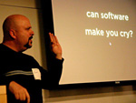
In a software design meeting the other day, I found myself saying “it needs to be a little less here” (tapping myself on the forehead) “and a little more here” (tapping myself on the heart).

As a pointy-eared technical guy, I’ve long been resistant to this type of language, knowing it to be logically meaningless. After all, the heart is merely a muscle that pumps blood, right? But the heart is also a potent symbol, and I hope my meaning was clear to the programmers in the room: the software under discussion was intelligent, but lacking in emotional appeal.

Increasingly, I find that one of the things that separates software that I love from software that is merely adequate is the presence of heart; and this is something that programming books (and the programmers who write them) tend to give short shrift. We programmers will discuss speed, efficiency, maintainability, and robustness till the cows come home, but very rarely will we admit that our software needs to be more likable. We are an army of tin men, hacking away at the thicket, with increasingly powerful hatchets, and hollow chests.

What gives software more heart? What makes a user have a more meaningful and fulfilling relationship with a collection of ones and zeros? A few things that come to mind are personal relevance, simplicity, directness, judicious randomness, pictures and sounds and above all, a little silliness.

Personal Relevance

Probably the most direct way to make software pull at the heart strings is to fill it with people that are at the center the person’s life. Social apps, such as those that use Facebook connect or the Flickr API, are a good example. Simply looking at a row of faces that are familiar to me can have a strong impact, and even more so if the software finds ways to deepen my relationships with other people.

It is clear that a lot of people are aware of this simple trick, and we are now seeing a plethora of companies that seek to add personal relevance to their brands by using Facebook Connect and similar measures. Unfortunately, not all those brands necessarily make sense in a social context, and inappropriate and ungainly attempts to add social features may actually distance users (why does Levis want to connect me to my friends?), rather than endear them.

Simplicity

To put it plainly, a simple elegant interface has more emotional appeal than an inelegant clunky one. It is hard to love a clunky interface (although I suppose pity can inspire love). More often than not, clunky interfaces make us angry and frustrated.

Most good programmers are well aware of this counter-intuitive fact: Simple interfaces are harder to make. When a program seems busy and complicated, it probably took far less time to make than the competing program which accomplishes the same things with fewer moving parts.

Programmers with heart work extra hard to insure that their software is as simple and direct as possible. Their interfaces become nearly invisible, and the user is absorbed in the experience, rather than the tool.

Feature creep can make software needlessly complex and ungainly. Some programmers are turned on by complexity, and add needless
customization features, thinking it makes the software more powerful and desirable. The effect, more often than not, is a kind of unloveliness.

Directness

Software that directly communicates what I desire to know and doesn’t hide behind a layer of abstraction tends to have a more direct emotional appeal. The idea here is to reduce the involvement of higher reasoning and logic, so that the lower parts of the brain are more directly involved in the user experience.

For most of us, to directly manipulate objects with our fingers, using a tablet, is more satisfying and simple than to issue text commands to manipulate those objects on a command line. Now, being a geek, I actually love the command line – but it’s not as counter-intuitive as it seems — I’ve gained a degree of facility with the command line that makes it a more direct means of getting things done.

Judicious Randomness

Never avoid the opportunity to use a random number generator somewhere in a program! I say judicious, because, obviously, you don’t want to employ randomness in computing income taxes or rocket trajectories, but there is always an opportunity to use a little randomness as a means of adding surprise and delight.

For years, I have considered the need for randomness to be one of the most direct predictors of how much I will enjoy working on a software project. When a program requires randomness, it is less likely to be serious and useful, and I am more likely to enjoy it.

One of my favorite examples of Judicious Randomness is the Google logo, which surprises me, every few days, by appearing completely different. The Google corporation has engendered a huge amount of good will from that randomized logo.

Pictures and Sounds

Although they can be horribly misused, in general, pictures and sounds can make software more emotionally appealing, because they more fully involve the brain than text alone, and help to make the experience more direct.

Well chosen icons, photographs, and subtle audio feedback can greatly improve the emotional impact of software. Example: I once traded up for a nicer cell phone. My wife got jealous, not because of the greater utility of the phone, but because it made more pleasing bell-like sounds when the keys were tapped!

A Little Silliness

For me, injecting small amounts of playfulness is an important part of software design. Sadly, it is something that is often scrupulously avoided by serious-minded programmers, who, seeking to make their wares appear professional and useful, carefully drain them of all possible fun. I don’t care how serious the intent of a piece of software is – nobody deserves to live a life devoid of humor. Even accountants and morticians deserve a laugh or two – probably more than most!

I’m not suggesting that everything needs to be hugely silly. But there is a huge difference between a little playfulness, and zero playfulness. When there is zero, I can’t tell that the software has a beating heart behind it. It is software made by mindless, joyless drones.

Back in the 90s, I worked on an avatar chat client, and added a feature that removed all the “props” or additions to the base avatar. I labelled the button “Naked,” and I still believe that little button label was one of my best ideas.

So there you have it – some random musings on software with heart. Got any examples of your own?