April 21st, 2006
One of the following five foods is different than the others.
A) Grape Nuts
B) Egg Salad
C) Eggplant
D) Egg Cream
E) Eggroll
Which is it?
The answer is given below, in the inviso-text.
The answer is “any of the above.” Here’s why:
A) The only one which does not contain the word egg.
B) The only one which contains the food in its name (grape or eggs).
C) The only one which is not a mixture of ingredients (and occurs naturally).
D) The only fluid.
E) The only one which I can’t easily separate from the others. I’m sure
you can come up with something better.
Permalink | 1 Comment »
April 13th, 2006
 I live near one of the coolest public libraries in Los Angeles, Glendale’s Brand Library and Art Center. I live near one of the coolest public libraries in Los Angeles, Glendale’s Brand Library and Art Center.
Here are a 10 good reasons why you should go.
1. The library sits at the the top of Western Ave in a beautiful park overlooking the valley. Excellent for picnic lunches.
2. The library specializes in music and art.
3. There is not a single book about accounting, insurance, or how to file your taxes.
4. There are no novels by Tom Clancy or Dan Brown.
5. There are books like Peepshows: A Visual History, and the Encyclopedia of Automatic Musical Instruments that cost much more on Amazon, or are shamefully out of print.
6. The library is full of cute geeks (and cute geeky librarians) who are interested in music and art. Wink wink, nudge nudge.
7. The library is in an eccentric Saracenic mansion, named El Miradero, that was built in 1904.
8. The mansion has its very own ghost.
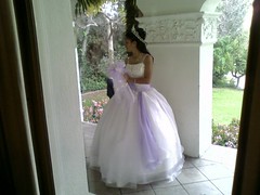
9. If you go on a Saturday, you have a pretty good chance of running into a Glendale wedding party and seeing 10 or 20 Armenian bridesmaids wearing poofy dresses.
10. If you meet your future geeky wife or husband at the Brand, you can get married there, and have a very romantic story to tell your geeky kids.
Permalink | Comments Off on Ten Reasons to Visit the Brand Library
April 10th, 2006
 I’m still working on making artificial yet authentic 17th century vocal music, so I thought I’d provide some MP3 samples to listen to, and give capsule reviews of a few of the different software packages I am using, in particular, Flinger, and Tracktion. I’m still working on making artificial yet authentic 17th century vocal music, so I thought I’d provide some MP3 samples to listen to, and give capsule reviews of a few of the different software packages I am using, in particular, Flinger, and Tracktion.
If you haven’t read my previous post about this project, check it out first and come back. Otherwise, some of this won’t make a heck of a lot of sense.
The program I am writing, Organum, is written in Perl. The program outputs algorithmically constructed 17th Century Latin hymns in the ABCPlus format, which can be converted to 4-part vocal sheet music (or piano/organ music) and to MIDI, using utilities available at the ABCPlus website. I’ve mentioned this excellent and free notation software in a previous post.
Last Saturday, I began producing audio files in which the computer “sings” the Kircherian hymns in Latin. Here is the very first result, “Ave Maris,” which is riddled with errors (mispronunciations and pitch problems), but nonetheless sent a chill up my spine the first time I heard it.
Ave Maris (MP3)
The lyrics being sung are:
Ave, Maris stella,
Déi mater alma,
atque semper virgo,
félix caeli porta.
Here’s a somewhat more polished example, using Kircher’s tables which produce music in the “Florid Style.”:
Veni Creator Spiritus (MP3)
The lyrics being sung (and/or mangled) are:
Veni, creator spiritus,
Mentes tuorum visita,
Imple superna gratia
Quae tu creasti pectora.
I produced the vocal recordings using an obscure program called Flinger, which was developed by the late Dr. Mike Macon.
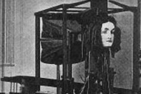
I learned about Flinger by perusing Princeton’s excellent VOCE website, which contains a history of speech synthesis, with a special focus on singing synthesis – a somewhat neglected topic, academically, because it doesn’t produce oodles of cash the way non-musical text-to-speech technologies do. VOCE is also where I learned about Joseph Faber’s 1845 artifical talking head, shown above, and other fabulous and eerie Promethian inventions. Needless to say, Father Kircher’s name comes up in this curious history. Once you learn his name, you’ll discover that his fingers are everywhere…
Speech and Singing Synthesis is something that, like computer graphics of the human face, is extremely difficult to do well, because we have a very large amount of neural circuitry devoted to listening and watching humans. Nonetheless, I enjoy the uncanny valley effect that singing synthesis produces. It’s eerie, but good-eerie.
Flinger (the name is derived from “Festival Singer”), is a singing synthesis program based on the flexible Festival speech synthesis engine from the University of Edinburgh. Flinger uses Festival to “sing” a MIDI file which contains information about which notes to sing, and which syllables to enunciate. Festival is controlled by a Scheme (Lisp) engine and has a flexible and broad set of parameters that can be tweaked. Flinger can output the singing directly to the speakers on the computer, or to a WAV file. Flinger can only perform one “voice” at a time.
Because Dr. Macon is no longer available to shepherd the Flinger project, the project is languishing at the Orgeon Science and Health University (OGI). The software is not well supported, and a bit persnickety. It is obvious from looking at the activity (or lack thereof) on the website that Flinger is in danger of becoming “abandonware” (if it isn’t already). Hopefully, one day the good folks at OGI will realize that it is more beneficial to them to release the source code, rather than to keep Flinger proprietary.
I had to do some work to get my MIDI files into a format that Flinger could handle. The format produced by the abc2midi utility I was using wouldn’t work, so I had to generate the MIDI files myself, in Perl. I accomplished this by reverse engineering the demo MIDI file that accompanies Flinger, and then writing code to produce files in the same format I found the CPAN Perl module: Perl::MIDI particularly helpful. It allows you to easily produce a raw dump of a MIDI file and then produce files which mimic the format of the dumped file.
To make a choir, I have to produce 4 midi files (one for each vocal part) and render each vocal line individually in Flinger (using slightly different vocal settings for each voice) producing 4 different WAV files (or more, if I want more singers in the choir). I then mix the results together in an audio editor and add reverb (LOTS of reverb, it hides a multitude of sins). There are two ways I commonly accomplish this type of task. For quick jobs, I will often use the excellent free audio editor, Audacity.
However, if I know I’m going to be spending some time massaging the audio, then I will use my favorite all-in-one home-studio software, Tracktion. Tracktion isn’t free, but it is incredibly full-featured for the price ($150) and, in my opinion, has the best user-interface of any piece of music software with equivalent functionality (e.g. Cubase, Cakewalk, etc. ). Here’s a screenshot showing the mix of my four synthetic vocal lines:

I originally bought Tracktion a couple of years ago, when it was being sold by it’s creator Julian (Jules) Storer, at Raw Material software.
Tracktion is a model of my conviction that the best software is written by one or two extremely talented designer/programmers, rather than large teams of middling programmers. Jules had a very clear idea when he started writing Tracktion of how he wanted it to work, and what he believed was broken in other music software packages. He intentionally violated a number of design conventions which are ubiquitious in music software (such as using tons of windows for different functions, and mimicking the user interfaces of historically popular audio interfaces). Instead Jules asked the question, “If you forget the last 100 years of music studio history, what is actually the most efficient and logical way to construct music on a computer?” Jules then set about answering that question by making some great music software.
Tracktion has since been picked up by the smart folks at Mackie, and it is up to version 2.0. It costs a bit more than it used to, but it is still dirt cheap (at $150) considering what you get (and what you don’t get). I worry that when it gets up to 6 or 7.0, it will start to lose some of its former elegance, due to feature creep, but right now, it is still a thing of beauty.
Permalink | 1 Comment »
April 2nd, 2006
Here is a screenshot I took while I was working recently, to document a fascinating project.
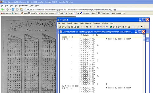
The project involves resurrecting a bit of technology from the 1600s. In the screen snapshot, I am entering numbers into a text file. I am copying the numbers, as you can see, from a digital facsimile of an old book that contains some curious latin writing.

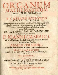
The numeric tables in the book are copies of tables that were inscribed on wooden rods and stored in a box, or ark, called the Organum Mathematicum.
The Organum was invented by Father Athanasius Kircher, the Jesuit polymath, and described in detail by Kircher’s disciple and associate, Kaspar Schott, in a 1668 book named after the device. The tables I am copying come from this book.
The Organum, a kind of primitive slide rule or abacus, aided various kinds of mathematical calculations, including multiplication, fortifications, horology, astronomy, astrology and so on. It was meant to be used the way we might use a laptop computer. Like a modern laptop, it contained a distillation of various bits of knowledge in a convenient form.
There are 10 sets of rods in the Organum, and the 10th and final set of rods allow non-musicians to compose music for church services. The rods contain short musical phrases that are intended to be combined together to create longer pieces. It is the data on this 10th set of rods that I entered into my own laptop computer.
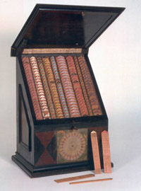
A few of these Organums still exist, including this beautiful late 18th century model in the History of Science Museum in Florence.
You can see some of the rods, which have been removed on the lower right.
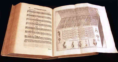
There are also existing versions of a related device, the Arca Musarithmica or Arca Musurgica which contained tables for music only, and had a larger set of music tables than the Organum. This device was described in detail in book 8 of Kircher’s massive tome, Musurgia Universalis (1650), shown below, with the fold-out illustration of the Arca. I mentioned this book a couple of weeks ago, in connection with Cuckoo Clocks.
I am in the process of writing a computer program that executes Kircher’s instructions for composing music, using the tables or tariffa in these two books. My program, is a Perl script called Organum. You provide the program with a few parameters, such as the title of a particular hymn that you wish to set to music, or a particular set of tables you wish to use, and it does the rest, randomly combining various musical phrases from these tables (according to Kircher’s instructions) and assigning pitch and rhythmic values from the tables.
The program is basically working now, but still needs a little more data and some finessing. I have a complete set of tables from the Organum, but do not yet have complete set from the Arca. Here is a sample of music produced by Organum.
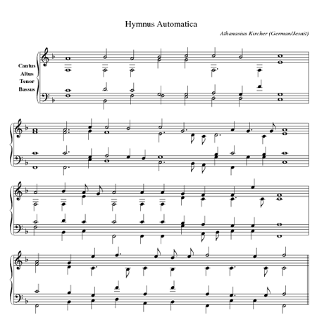
(Click for MIDI)
Organum outputs music in the ‘ABC Plus’ format. There are some great open-source utilities for converting these files into sheet music and MIDI files on the ABC Plus web site.
Here is a sample 4-part vocal score produced by my Organum, using some of the other tables from Kircher’s Organum. Here I have used the Organum tables to set the words to the hymn Ut Queant Laxis Resonare to music. Coincidentally, this is the hymn from which we get the musical names “DO RE ME FA SOL LA SI,” originally “UT RE ME…” — these are the first syllables of each line of verse.
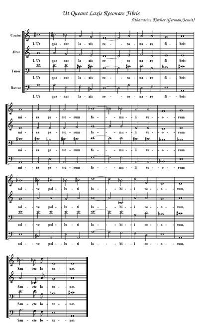
(Click for PDF)
Ut Queant, is in Sapphic meter, containing lines of 11, 11, 11 and 5 syllables. There is a set of tables in the Organum for setting hymns in this style, as well as 3 other popular styles (in 1650). Most latin hymns are Ambrosian or Gregorian, and are in iambic tetrameter, having 8 syllables per line. Kircher refers to these as Archilochean verses, and provides tables for setting them in two different musical styles: the stylo simplico, or 1st species counterpoint, and the stylo florido, or 5th species counterpoint.
According to Kircher’s instructions, the following choices can be made arbitrarily:
- Which of 8 modes or scales (Dorian, Lydian etc.) to set the piece in.
- The choice of pitch phrases for each strophe of verse (typically 4 strophes, each with 6 or more phrase choices).
- The rhythm to assign to each pitch phrase (6 or more per strophe).
- Which melodic line to assign to each of the upper voices (Canto, Alto, Tenor — 6 possible combinations)
Because of all the possible combinations, the Organum (and my software) is capable of producing about a million pieces of music. Of course, since the music is generated from a small set of source phrases, and is intended to create polyphonic hymns in a particular style, its expressive range is limited. Nonetheless, by substituting the tables, it would be possible to use Organum to generate music in other well defined styles (with correspondingly limited expressive ranges), such as ragtime, or 50’s rock & roll. Of course, algorithmic composition has come a long way since 1650, and there are newer and better ways of accomplishing this, such as David Cope’s Experiments in Music Intelligence.
Nonetheless, Kircher’s algorithm has a very similar result to a method used in modern computer-aided compositions: Markov Chains. In this style of composition, you analyse existing pieces of music for their statistical properties, recording which groups of notes are likely to follow other groups of notes. You then use this information (which is a kind of digest of the original piece) to create new compositions in the style of the original piece. Because Kircher has recorded little snippets of music in the tables in the style he wishes to emulate, the result is very similar to what you get with Markov Chains.
Eventually, I hope to build a physical Organum or Arca to house my software. The box will resemble the real thing, and will contain wooden rods, which trigger hidden switches which operate the software. The box will have a MIDI output in the back and will be used in live performance.
All in all, an interesting project which combines a number of interesting disciplines, including computer science, music, history and art.
I would like to thank Dr. Hans-Joachim Vollrath, professor of Mathematics at the University of Wurzburg (where Kaspar Schott once taught), for his assistance in providing photographs of the tables in Organum Mathematicum. You can learn more about the Organum and its other, non-musical capabilities, at Vollrath’s excellent website.
I will post more files, including my perl scripts, when the project is a little closer to completion.
Permalink | 6 Comments »
March 30th, 2006
It is harder for a big company to produce decent software than a small company, as illustrated by this ugly little dialog box:
Why do big companies have trouble making decent software?
1) They have too many employees.
I believe that design and coding should be done by very small teams, and that the same people who code should design. Almost every time I visit a large company (and I’ve visited several over the last 15 years or so), I see a software team that is from 3 to 10 times too large. At these sizes, the majority of the engineers become “paper engineers.” They spend most of their time in meetings doing “design,” and delegate the actual coding to underlings, who are not experienced enough to code efficiently.
2) They have too many constraints.
Software projects at large companies are generally affected by constraints that have nothing to do with engineering. As a result, the teams are often under unreasonable deadlines. Many managers believe that the only way they can meet unreasonable deadlines is to hire more engineers. This never works, it just makes the work take longer. When this doesn’t work, the managers outsource important jobs that should be done in-house to external companies (with smaller, and more effective teams). The outsourcing produces even more in-house communication problems, and utlimately the quality of the software is compromised.
Although large companies are not incapable of producing good software, they are severely challenged and must take extraordinary measures to overcome those challenges.
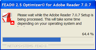
Case in point: Adobe (Acrobat) Reader.
I have a love/hate relationship with Adobe Acrobat. I love the PDF format, or more accurately, I love being able to generate documents that contain things such as music notation, puzzle diagrams and math formulas, and share them with any newbie on the planet without too much trouble. PDF is a good format for doing this, since most people have Adobe’s PDF reader. I usually use non-Adobe tools, such as my own Perl scripts (with various open-source libraries) and the excellent open-source programs GhostView/Ghostscript to generate these files.
On the other hand, I think Adobe Reader is bloated and buggy and I hate having to support it. My free Sudoku puzzles generate at least one or two Adobe-related support emails a week.
Version 6 of Adobe Reader was especially nasty – it had a horribly long load time, as it loaded a bunch of plug-ins (which I never used). The unofficial workaround to this was to delete all but one or two of the plugins. Programs that see such wide use should not require “unofficial workarounds.”
Version 6 of Adobe Reader has some nasty bugs and it often crashes current versions of Firefox.
To avoid the problems with Version 6, I recently downloaded the installer for version 7 of Adobe Reader (perhaps the bugs are an inducement to get you to upgrade?). Like lots of free programs distributed by large companies, I had to click on a few checkboxes to prevent it from installing stuff I don’t want, such as the Yahoo toolbar. I realize this is a very common practice these days, I’ve seen it in installers from most large companies such as AOL, Microsoft, Adobe, and others. Its also annoying as hell, and bad marketing.
While installing Adobe Reader 7, I was greeted with this remarkable, and theoretically unnecessary dialog box:
This dialog gives away a number of interesting bits of information about the Adobe Corporation. First of all, it tells us that despite Adobe’s large size, their engineers are incapable of making a software installer that meets all the requirements of Adobe’s marketing department. In all likelihood, the folks in the marketing department decided to outsource with “NETOPSYSTEMS” to fix a problem with Adobe’s installer (a problem that could have been avoided by not including crap like the Yahoo toolbar and a bunch of unnecessary plugins).
Secondly it tells us that the marketing department was so desparate to fix this problem, that they were willing to let another company display their branding information during the installation process. Most large companinies hate doing this, and it shows that Adobe was pretty desparate to get this product out the door. Perhaps they reached a compromise solution and got them to dim it out on the bottom a bit.
Thirdly it tells us that Adobe, despite being a very large company with large resources, does not do a very good job of doing quality control on it’s software installers, because otherwise, someone would have surely noticed that the text in that dialog box is cut off on at least some machines (namely, mine, a run-of-the-mill laptop from Dell).
Fourthly, it tells us that the brilliant user-interface designers of FEAD believes that I really care to know that this particular step in the installation process is 64.4 percent done (or that the coder is working under deadline and using a built-in widget). This is a common feature in interface designs called “unnecessary accuracy,” (the bar alone should be sufficient here) and it is probable evidence that Netopsystems is affected by the diffferent set of challenges that affect companies that are too small.
Finally, it tells us that the code for Adobe Reader 7 is just too damn big, and so is Adobe.
But perhaps I grumble too much. Like a shark and pilot fish, it is because large companies like Adobe exist and prosper that small companies like Netopsystems exist and prosper.
Permalink | 1 Comment »
March 23rd, 2006
According to a recent post in the Flickr Blog the ‘favorite’ color of the Flickr community is a warm brownish taupe. The blog points to a nifty application, favcol which computes the average color of all the images on Flickr recently tagged ‘favcol’.
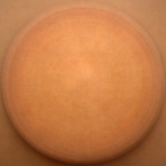
In actuality, that brownish taupe color is what you tend to get if you average any large collection of digital photographs, regardless of the source, and how they are tagged. I first noticed this early last year when I was working on mosaics, and then I *really* noticed it when I averaged a few thousand photographs of diverse circular objects (courtesy of the squared circle group on Flickr) and got this:

If I crank up the contrast, the result looks like this “bronze shield”:
Shortly afterwards, I computed the average color of a few thousand images which correspond to specific words, and produced this image:
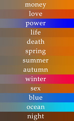
The color on the left side of each word is the average color (which is usually brownish) and the color on the right side is the same color with the saturation cranked up (which is mostly orange). The exceptions were discussed in the thread – mostly due to small sampling size or tags that produce more uniform color.
I believe this is a well known phenomenon among folks who work with a lot of digital images.
The reason the color is so dull is because you are averaging a bunch of images which contain disparate colors. When you average opposite colors together, the result tends to be medium gray (#808080 or #7F7F7F). Because the red, green and blue components all average to the same value, like so:
So, if the color distribution were truly random, the average color would be gray, not brown.
What we’re actually seeing is a slight red shift (and an even slighter green shift). The ‘favcol’ color shown on the flickr blog is #736a64 or
and the color of my bronze shield from a year ago is around #847161 or
I suggest we formally name these brown colors that we commonly see when we average the colors. My suggestion is: “Mob brown”. Mob is a backronym which stands for “Mean of Billions”? Another name I thought might be cute is “Brownian orange.”
[ EDIT: More recently I’ve started using the label “Emergent Orange” 12-5-2013 ]
I have participated in a few discussion threads which discuss the brown/orange shift (here’s one, here’s another), and I will offer a few possible theories as to why we are seeing it.
Theory 1.
Most of the stuff we photograph (with the exception of the sky) isn’t blue.
I have a related theory, which might explain why our retinas are not sensitive to blue: must of the stuff that is interesting to monkeys (or whatever you call our biological ancestors) isn’t blue. Our eyes are most sensitive to green. This would be a desirable trait for a vegetarian critter that evolved in a verdant area.
However, in our modern life there is less green stuff than in our monkey life. Thus the red shift. We plaintively wish for a return to the green shift.
Theory 2.
Digital cameras tend towards “warm” colors – they are designed by the manufacturers to do this, because they are mimicking the way film used to work, or because “cold” pictures look creepy. I don’t know if this is true, but it appeals to me. Kind of like all those happy endings that movie studios tack onto the end of movies.
Theory 3.
A lot of photos are taken in artificial light, or with the use of flash, and the colors in those photos correspond to the spectra of those lights. Many folks with cameras never figure out how to turn the flash off.
Theory 4.
The sun is a hot yellow star. It is unreasonable to assume that things lit by it would have evenly distributed colors.
Theory 5.
Orange is the color of life. Also, it is the color of Florida orange juice.
Theory 6.
People like to photograph Buddhist monks, because they have pretty orange robes. Any statistically random collection of photos will contain at least a few photos of Buddhist monks. The robes tilt the balance. Especially if the monks are fat.
Theory 7.
Harry Knowles.
Theory 8.
Theodore Sturgeon said that “90% of everything is crap.” Thus the brown.
Actually Sturgeon might not have said exactly that. But that just proves his point.
Got any more theories? Let me know.
Permalink | 5 Comments »
March 22nd, 2006
from Machine Project, my favorite art gallery for geeks here in Los Angeles.
Hands On’Semble
Episode Four of Everybody Loves Difficult Music, a music and discussion series
Thursday March 23rd 8:00pm
Please join virtuoso hand percussion group Hands On’Semble as they play original compositions that blend the rhythmic concepts and playing techniques of North and South India, the Middle East, West Africa, Indonesia, South America, and western chamber music. After each piece, the group will deconstruct and explain the concepts, forms, devices, and techniques used as means for both composition and improvisation.
—————————————————–
Stina Hanson, Douglas Wadle, Vitamin Wig C [Robert Hansen + Aaron Spafford]
Episode Four of You Too Can Play Difficult Music, a series of audience participation performances
Saturday March 25th 8:00pm
Stina Hanson presents the Super Fantastic Difficult Music Marching Band, with the goal of getting as many people playing, marching and clapping together as possible. Kazoos of multiple hues will be provided, as well as a selection of sheet music to the songs everyone seems to know but has no idea where they learned. What kind of marching band would you like to be in? What does it wear? How does it move? How will it interpret “You too can play difficult music”?
Douglas Wadle will be presenting an audience participation version of Logos prior Logos. The piece is a rules-based improvisation based upon the formal logic statements contained within the score/painting. He will, time permitting, also blather on about the work and its significance or lack thereof in relation to the notion of difficult music.
Vitamin Wig C and friends will be engaging in a sloppy improvisation incorporating mouth sounds and vocalizations, simple percussion instruments, pre-recorded media, and a host of familiar musical instruments. Audience members will be asked to please turn UP their cell phones!
Permalink | Comments Off on Partipatory Music at Machine Project
March 20th, 2006
 I’ve been a little obsessed with cuckoo clocks for the past few weeks, and here are a few cuckoo-related oddments. I’ve been a little obsessed with cuckoo clocks for the past few weeks, and here are a few cuckoo-related oddments.
A friend of mine gave me an unwanted cuckoo clock, and I repaired it and hung it on a wall at home. Every time the cuckoo chime goes off, it makes me giggle. Sadly, most of the other members of my household find the noise annoying; so the clock will stay on “mute” for much of the day. I asked my co-workers if they would terribly mind if I installed the cuckoo clock in the office, and was greeted with dead silence.
So… no cuckoo clock in the office, I guess.
Incidentally, an excellent way to become my friend is to give me some piece of unwanted 19th century technology. Cuckoo clocks, accordions, Jacquard looms, fully functional steam engines — these are all excellent choices. But I digress…
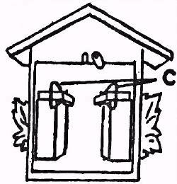
The traditional call of the cuckooo clock is a two-note melody: “cuc-koo! cuc-koo!” The rendition commonly heard in these clocks is a descending major third (such as the pitches E and C). The call of the cuckoo was notated as a descending minor third (F and D) in 1650 by Athanasius Kircher, in his wonderful book Musurgia Universalis. Shown above is an excerpt from a famous illustration in that book which notates the calls of various European birds, including the nightengale and the cuckoo. Perhaps the calls started as minor thirds, but most of the modern clocks I’ve heard use a major third.
Artisans started making cuckoo clocks in the black forest region of Germany about a hundred years after Kircher’s book. Most of the kitschy clocks being sold today are based on 19th and early 20th century designs. Whether those first clocks used minor thirds, or major thirds, I don’t know. The cynic in me likes to think they used minor thirds, but then the marketing guys made ’em fix it: “We need happier sounding clocks!”
I don’t particularly like the cases of most cuckoo clocks (they range from “not too tacky” to “quick! put it in the attic with the waffle iron!”), but I love the silly noise and the simplicity of the mechanism that produces it.
 The cuckoo’s call is produced by two whistles, each operated by a small bellows at the top. The clock movement pumps the bellows to make the call, at the same time striking a gong — mine is made of a coil of wire — mounted on the back of the clock. The tail of the cuckoo bird is attached to one of the bellows-tops, so that the bird bobs down on the first note and back up on the second note. The cuckoo’s call is produced by two whistles, each operated by a small bellows at the top. The clock movement pumps the bellows to make the call, at the same time striking a gong — mine is made of a coil of wire — mounted on the back of the clock. The tail of the cuckoo bird is attached to one of the bellows-tops, so that the bird bobs down on the first note and back up on the second note.
Here’s Ralph Brendler’s page which describes how he make a home made cuckoo clock, using readily available parts (movement, bellows, etc) from a clock supplier. This page also has a pretty detailed description of how the chiming mechanism works.
If I were to make my own cuckoo clock, I think I’d deviate a bit more from the classic designs. I think it would be cool to make a nautical themed cuckoo clock, with carvings of various sea critters: octopusses and star fish. When the door opens up, out pops a shark! The two whistles are tuned to an ascending minor 2nd, so that instead of hearing “cuc-koo!” you hear the two notes from the theme to “Jaws,” by John Williams. Perhaps there are some other good two-note themes that would make for good clocks.
I’ve also been thinking about making a programming environment for kids called “Cuckoo”. The environment would make it easy to assemble automatons and clockworks with gears — you’d snap the gears together and they would automatically mesh and “work” properly. One of the built-in projects would be a working virtual cuckoo clock. I must admit, the name, “cuckoo,” came before the idea. But sometimes, a cool idea must start with a cool name.
Sadly, it is likely I won’t have much time to work on either of these cool projects this year, since I’ve been enormously busy working on things that actually generate money. But cuckoo-clock design sounds like an awfully nice gig, doesn’t it?
Permalink | 1 Comment »
March 12th, 2006
 I have a peculiar problem with telephones. When ever I pick up a ringing phone, and say “hello,” there is invariably a long pause, and then the other person says, tentatively, “Hello? Is this Jim?.” I have a peculiar problem with telephones. When ever I pick up a ringing phone, and say “hello,” there is invariably a long pause, and then the other person says, tentatively, “Hello? Is this Jim?.”
It turns out that many people assume that they are listening to a recording when I answer the phone. I finally figured it out: Most people use intonation that makes “hello” sound like a question: “Hello?” They raise the pitch at the end of the word. For some odd reason, it feels more natural to me to do the opposite. I phrase “hello” like a statement or exclamation: “Hello!” I’m not sure why I do this, but to me it feels rude, or maybe weak to phrase “hello” like a question. I don’t know, maybe it’s a guy thing, like asking for directions. I want to demonstrate my manly confidence in answering the phone without the need for questions.
Another reason for the difference is that most people use “hello?” to establish who is calling. This is part of their normal telephone conversation script which includes the following steps, in order:
- Establish who is calling (hello?)
- Greet the caller (how are you)
- Receive greeting (i am fine)
- Idle chit chat (How’s the kids? How’s the weather?)
- Leisurely cut to the chase (So, ah… the reason I am calling…)
- The chase (yada yada yada)
- Tangent into idle chit chat (So, what about them dodgers?)
- Let the person off the hook (OK, I better let you get back to work…)
- Get off the hook (Seeya!)
It’s a lovely ritual, and for the most part, I’m a big believer in rituals — but not on the phone. A telephone call does not need to be like a long lingering courtship. As an amateur telephone efficiency expert, and confirmed antisocialist, my recommended sequence of events is as follows:
- Greet the caller, request them to identify themselves and cut to the chase (Hello!)
- The Chase (yada yada yada)
- Get off the hook (Ciao!)
It occurs to me that it might be easier to get people to cut to the chase by saying something like “Hello! This is Jim. This is not a recording. You may state your business now.” But perhaps this, too, would be confusing and hurtful to my callers. I do not wish to hurt feelings. I simply wish to accomplish more in a shorter amount of time. My impatience with telephone ritual is one of many reasons why I generally prefer e-mail for effective communications.
* * *
The word “hello” is a relatively recent innovation. Before the invention of the telephone, English speaking people did not use “hello” and “hi” to greet each other. They used “good morning,” “good afternoon,” “salutations,” “greetings,” and other phrases.
The first recorded use of “hello” as a telephone greeting dates from 1883. It is a variant of “hallo” which was used as a cry of surprise, as in “hallo, what is that?” or “hallo, I have a caller on my newfangled contraption!” “Hallo” is related to the older “Halloo” which was a cry to urge on hunting dogs. That’s right. When you answer the phone you are actually saying “Sic ’em!”
At the moment, the Nokias and Samsungs of the world are hard at work packing every possible feature into the cell phone in an orgy of “convergence.” My suggestion: Incorporate the features of the (discontinued) Sony Aibo. Not only will this pacify legions of angry robotic dog owners, but we can complete the circle and use “Halloo!” to urge on our packs of scampering telephones.
The scampering telephone above was created (by me, a few years ago) in Flash, using one of Eadward Muybridge’s photo sequences of a galloping horse as a template for the animation. There are numerous examples of Muybridge’s photo sequences online, and they make an excellent shortcut for lazy animators, such as myself.
Permalink | 1 Comment »
March 8th, 2006
 I guess you know your blog has arrived when people start offering you free stuff. I guess you know your blog has arrived when people start offering you free stuff.
Sprint contacted me a week ago to tell me that they wanted to give me 6 months free service and a free phone. This is part of Sprint’s “Ambassador” program, in which they are giving phones to bloggers. I assume they are hoping to generate some buzz in the blogosphere.
Sure, I’ll take a free phone! Thank you Sprint! Anyone else wanna give me some free stuff?
Sprint: Here’s your buzz. Buzz buzz.
This is good timing actually, because my daughter put my last cell phone thru the wash, damaging a switch in the recharge circuitry so that it constantly thinks it is recharging. That phone now belongs to her.
What Sprint doesn’t know is that when it comes to portable communications technology, I’m a neo-luddite (despite my overall high score on geek aptitude tests). I have never been capable of remembering my own cell phone number, and I dislike telephones of all kinds, as a matter of principle. I’m a big believer in email on desktop computers.
I am also incapable of operating the buttons on most cell phones one-handed, because my thumbs (like my giant brain) are about the same size as snow shoes. Curse you, giant thumbs!
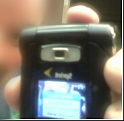
The phone arrived yesterday, and I’ve been playing with it, as you can see. It’s a Samsung A-920, an attractive phone with two LCDs and lots of flashy animations and sound effects. The first thing I did with it was ugly it up a bit, by taping a piece of paper with the cell phone number on the back. I don’t like having to do wade thru 7 keypresses to find it, and if my prior cellphones are any indication, it will take me approximately 6 months to memorize the number.
The free service includes Sprint’s “Power Vision” network, which basically means I can download and watch videos & music. This might be amusing, except that the choice of videos thus far is pretty paltry. Lots of pop music, “infotainment,” sports and other crap. The only thing offered that really appeals to me are the Bugs Bunny cartoons. Most of the music and entertainment-related offerings (not to mention the ringtones and wallpapers) are obviously aimed at a younger demographic (with bad taste) and not of much appeal to me. At some point I will figure out how to change my ring tone to something I actually like, like Terry Riley’s “In C.”
I think it would be kind of cool if there was a video channel that offered vintage silent movie clips, or old 16mm porn reels from the 50s. The size of the screen seems appropriate for “vintage low-fi” – but I don’t think such goodies are likely to appear any time soon. I think this kind of service would take off if Sprint provided the ability for people to broadcast their own collections of video, rather than using the “walled garden” concept, which I’ve always hated.
But honestly, there are very few times during my usual week in which it actually makes sense for me to be watching video on a cellphone. Not when I’m driving to and from work, not when I’m working, not when I’m home (and have access to a comfy chair and a regular tv). So mainly, the service seems to be more of a novelty than anything else. I tried to interest my daughter in watching a video on my cool phone, but she was busy with her i-pod.
The feature I *am* enjoying is the camera, since this is my first cell phone with a camera, and it allows me to create,
rather than consume content. I wish, however, that the EXIF data for the images that I send to myself via email included the GPS data, so I could automatically geotag my photos. If I had that, I’d probably get busy and write some cool software to exploit it.
I also wish the GPS map feature was a bit more “real time” – the phone-to-server interaction that is required for each new map view is time-consuming. I think GPS and cameras on cell phones is a great idea, but this particular implementation feels incomplete.
In general, I think cellphones are suffering from “convergence crisis.” They are trying to be cameras, but they’re not as good as cameras. They’re trying to be GPS devices, but they’re not as good as standalone navigation aids. They’re trying to be web browsers, they’re trying to be television sets, they’re trying to be i-pods, they’re trying to be game-boys. Nix, nix, nix, nix.
The only thing they truly excel at is being phones. In almost every other area, the tendency towards miniaturization and generalization does horrible things to the user interface. I tell you what I’d like – a larger (say palm sized) flat, flexible device that folds into my pocket without making a lump, and can be operated one handed with giant thumbs. Something about the same
form factor as my wallet, that could actually *replace* my wallet. Maybe it holds my money and stuff too.
Anyway, it’s only been a day, and I’m too cynical by a mile and a half. I’ll keep you posted if I find any new amazing tricks to do on my free phone.
Permalink | 2 Comments »
|
|