Blog  |   Puzzles  |   Books  |   About

Topspin

August 22nd, 2008

A few days ago, Ian Rogers mentioned that his company, Topspin, is adding “four more rock star engineers in the last two weeks of this month.”

At the risk of seeming immodest, I appear to be one of said rock stars. I’m joining Topspin.

“Damn. Look out. Look out.”, wrote Ian.

Heh… Hope Ian doesn’t regret those words :)

Today was my last today at Yahoo! Music. I spent much of it cranking out a fun little multiplayer trivia game for Y! Hack day, something I’ve been obsessing about for the past few weeks. Hopefully the awesome folks at Y! Music will get a chance to turn it into a real product.

I start at Topspin on Monday, adding my electric piano to their already too-large pile of office music equipment.

Look out!

Look out indeed.

Flickr’s Most Interesting Photos

August 12th, 2008

Coverpop: Most Interesting, 8-13-2008

This new interactive mosaic, from my Coverpop website, shows the most interesting photos on Flickr, based on Flickr’s mysterious “interestingness” metric, which I assume has something to do with kittens and/or babies…

One thing I’ve noticed is that Flickr’s interesting photos tend to look compelling at very small (i.e. thumbnail) sizes, which makes sense, when you think about it. Fortunately, this quality also makes them good candidates for my mosaics.

There are some awesome photos to be seen here. Check ’em out!

A Big Picture

August 9th, 2008

My latest mashup is an interactive graph that aggregates data from Google Trends for Websites into a single graph which can track hundreds of sites.

If you search for a domain you are interested in, it automatically gets added to the graph. Hopefully, over time, a large number of domains will get added to it, and we’ll get an even bigger picture of site traffic on the Internets.

Domains searched within the last hour are rendered in brighter colors, and gradually fade, so you can see what people are interested in.

I changed the coloring in this graph from the one shown in the previous post: red lines now indicate sites which are losing traffic.

Enjoy!

Google Trends: a bigger picture

August 8th, 2008

Google Trends - A bigger picture

I made this graph by aggregating data from Google Trends for about 150 domains, including the Alexa Top 100.

The lines are colored according to the slope – red when going up, and blue when going down.

The graph is logarithmic, so that low traffic websites can be shown together with high traffic ones.

The site with the most traffic shown here is yahoo.com. Note that Google does not provide this data for it’s own websites, such as google and youtube.

That extra bumpy line in the top section is Mozilla.com, whose traffic gets big spikes when there are new releases of Firefox.

The section near the middle, where all the lines turn blue, appears to be the Christmas holiday.

One of the interesting things about this data is that their appear to be ceilings, where sites cluster, such as the one below 10M. It is difficult to break above these ceilings without having a radically different kind of site (such as a large social network).

I’m currently working on an interactive version of this graph, that will enable you to pop-out individual lines, add new websites, and find out how your own favorite websites fit into this picture.

Jamming with the Yahoo! Music APIs

August 5th, 2008

Are you a computer nerd? Do you like music?

I’m quite pleased to report that the hard working web-services team here at Yahoo! Music unleashed a very powerful new Music API upon the music-nerd community this week. This is the same API we used to build the Facebook Music Videos app, reported here some months ago, as well as much of the content at the Yahoo! Music website.

I’ve written a introductory tutorial for the Yahoo! Developer Network, which includes sample code for a bare-bones video browser, similar to the Facebook app, to help get you started.

This API will give outside developers access to Yahoo!’s enormous music database: you can present lists of popular artists, their discographies, similar artists, display stills from their videos and even play the music videos themselves.

Check it out!

Theory of the Precious Object

July 31st, 2008

Some years ago I developed a crackpot idea I call The Theory Of The Precious Object.

This theory is based on the following observations:

  1. Crows, racoons and other animals are known to be attracted to shiny objects.
  2. Many products which succeed in the marketplace resemble the objects which attract these animals.
  3. Our attraction to these shiny objects is not always entirely rational.

My hypothesis is that the brain is hardwired in a very fundamental way to be favorably disposed to certain kinds of objects. We contain, within us, an ideal object, or archetype, which we compare other objects to. The closer things are to this ideal object, the more likely we are to desire them, and the more precious they are to us.

A precious object is any object which has most (if not all) of the following five properties.

It is small.

It is shiny.

It is round.

It is hard.

It is simple.


Here are some precious objects from the past and present. I’m sure you can think of a few others.

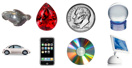
Once you start thinking about precious objects, you’ll start to notice them everywhere. There are whole catalogs devoted to them. There are stories about them, and movies.

Here’s a bit more thinking about the five properties of precious objects.

It is small.
Obviously, a Volkswagen is larger than a diamond. I would say a Precious Object is small for it’s class.

It is shiny.
All the precious objects I have identified have a glossy or shiny aspect to them. One of the better examples of this is the Audio CD. I am convinced that a big reason for the rapid success of the CD in the 1980s (over vinyl and cassette) was not that it was digital, but that it was small, and irridescently shiny. If the CD had more closely resembled a vinyl record, I do not think it would have succeeded so quickly.

It is round.
Not all precious objects are perfectly round, but most of them are exhibit symmetry, and often radial symmetry — I use “round” as a placeholder for “exhibits high degrees of symmetry”. When we prepare gems for market, the biggest change we make to them is to render them symmetrical. Why do we do this? Doesn’t it technically make the diamond less valuable to cut chips off of it? We do it because it makes the diamond more precious in our minds.

It is hard.
I haven’t been able to identify any soft precious objects. Perhaps one reason is that pliability tends to have an effect on the shape of an object, making it less symmetrical.

It is simple.
Clearly a Volkswagen is not a simple object, but all precious objects, including the Beetle convey an outward simplicity, compared to the not-so-precious objects they contend with in the marketplace. Compare a regular cell phone (itself a precious object at one time) to the IPhone. Turned off, the original IPhone is just a glass and metal slab. No buttons.

So how can we benefit from this theory? There are two ways. As product designers and marketers, we can work to insure our products meet these desirable qualities. Some companies are already very good at this, you may have noticed.

Secondly, as consumers, we can recognize that our desire and attachment for small shiny objects is ultimately irrational — it is an aspect of our animal brains. More often than not, the joy these objects bring into our lives has more to do with the status conferred by possessing them, rather than their actual function. Or perhaps we can say that their preciousness is their function.

Earthquake knocks ink off puzzles. Ink manufacturers sad.

July 29th, 2008

There was a 5.4 earthquake here in southern California today, and it had a curious effect:

All the heavy black areas were knocked off of my Kakuro puzzles. While they are slightly less attractive, I’m told they use up considerably less ink and toner this way, so I guess I’ll keep ’em. I hope you like the new look.

Meanwhile, I’ll have to figure out something to do with all these odd shaped black pieces I have left over…

Tangram puzzles, anyone?

Fun with the Droste effect

July 27th, 2008

"Drosterising" myself - Rosario - ArgentinaVia this Digg post, I found this awesome image manipulation tool called MathMap, and a Flickr group of photos using Escher’s Droste effect.

Mathmap has been around for a while, as a plug-in for GIMP and more recently as a standalone program for Mac OS X.

If you want to get a better idea of what Mathmap is all about, check out this brief video presentation by Mark Probst, the developer.

I’m surprised I hadn’t stumbled across MathMap before, as it is very similar in spirit to my (now ancient) image manipulation programs Pixel Magic and QTS, but much, much nicer. It has a richer language and more interactive interface. I look forward to playing with it.

Probably one reason I haven’t encountered MathMap before is I’ve never been an active GIMP user, having been spoiled with free copies of Photoshop as long as it’s been around. Photoshop is horribly expensive though, and I think I’ll be giving GIMP a closer look again in the coming weeks. My daughter needs some powerful image processing software, and I’m not inclined to pony up to Adobe…

Hubble Kaleidoscope goes Online

July 17th, 2008

The Onion reports that the Hubble Space Kaleidoscope finally went online Tuesday, capturing the first images which prove beyond a doubt that the universe is utterly crazy looking.

According to the article, the HSK features three fine-guidance optical control sensors, a wide field and planetary camera, a faint object spectrograph, and three primary rectangular plane mirrors inside a rotating 30-meter titanium tube. The object chamber, located on the end that gathers and focuses incoming light from the visible part of the electromagnetic spectrum as well as the infrared and ultraviolet continua, is filled with 10,000 pounds of marbles, costume jewelry, beads, and the largest bits of colored glass ever produced.

Here’s a sample image of the crab nabula, taken with the space kaleidoscope.

And here’s an amateur photo of the same nebula I took with my backyard Dobsonian Teleidoscope.

Kaleidoscope: Crab NebulaNot nearly as nice, eh?

Weezer sing-a-long

July 16th, 2008

Weezer recently invited the audience to bring their own instruments, while they were taped for Nissan Live Sets. My friend Mike attended and had a blast. He’s one of the guitarists on the left.

More videos from this event here:

link