
Google Trends: a bigger picture
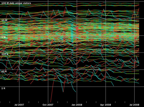
I made this graph by aggregating data from Google Trends for about 150 domains, including the Alexa Top 100.
The lines are colored according to the slope – red when going up, and blue when going down.
The graph is logarithmic, so that low traffic websites can be shown together with high traffic ones.
The site with the most traffic shown here is yahoo.com. Note that Google does not provide this data for it’s own websites, such as google and youtube.
That extra bumpy line in the top section is Mozilla.com, whose traffic gets big spikes when there are new releases of Firefox.
The section near the middle, where all the lines turn blue, appears to be the Christmas holiday.
One of the interesting things about this data is that their appear to be ceilings, where sites cluster, such as the one below 10M. It is difficult to break above these ceilings without having a radically different kind of site (such as a large social network).
I’m currently working on an interactive version of this graph, that will enable you to pop-out individual lines, add new websites, and find out how your own favorite websites fit into this picture.
