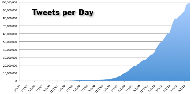
Twitter Volume since 2007

This weekend I compiled the data to produce the above graph, showing the level of activity on Twitter.
I figured this out using a commonly known method. Every tweet has a unique id number, for example the 20 that appears in the URL of this tweet which kicked off the service:
http://twitter.com/#!/ev/statuses/20
Assuming these id numbers are handed out sequentially, you can comparing the dates and id numbers of successive tweets to determine the rate that tweets are being created.
As it turns out, this method is a little tricky with Twitter, since there have been periods (such as most of 2007) in which Twitter incremented their ID numbers by 10, causing an apparent 10x increase in their volume. Perhaps this is why Tech Crunch misreported the daily tweet figure (for March of 2008), saying it was 3 million a day, when it was actually in the range of 400-600k.
On February 27th, 2008, Twitter went back to handing out sequential numbers. I suspect this was done to postpone the Twitpocalypse — the point at which the id numbers passed 2 billion, which might have caused problems with some Twitter clients that didn’t use enough bits to store the ID numbers. This eventually happened late on June 12th of 2009, but it would have happened a year earlier, if Twitter hadn’t gone back to sequential numbers.
When Twitter’s service goes down for maintainence (or other ranges), they often start back with an ID number which skips a big chunk, causing unrealistic spikes in the apparent tweet rate – they did this intentionally, for example, to trigger the Twitpocalypse a few hours early while employees were still awake. I’ve filtered out most of these spikes in the above chart.
The current Twitter volume is approaching 100 million a day, and has already exceeded it on a couple days this month.
Interestingly, we appear to be approaching a plateau, although it is still a little too soon to be sure (I can imagine myself thinking the same thing in July of ’09, and being quite wrong). The growth rate declined a bit this summer, and since Twitter started rolling out the “New Twitter”, it has declined more dramatically. I’m not sure if the New Twitter is a factor, or if Twitter is simply reaching a saturation point.
It will be interesting to see if Twitter manages to sustain another strong growth spurt in the coming months.
For comparison, here’s a very similar graph that Twitter produced a month ago, and here’s what Google has to say about visitors to Twitter’s website.
UPDATE:
On November 4th, Twitter switched to a new ID system called “Snowflake” that prevents ID counting in the manner I described above. The new ids contain a time stamp (in milliseconds), a machine number, and a sequence number. You
can still estimate the overall traffic by looking at the sequence numbers, since the amount of non-zero sequence numbers is proportional to traffic, however this method requires a larger sample of tweets to get decent accuracy.

