
A Big Picture
 My latest mashup is an interactive graph that aggregates data from Google Trends for Websites into a single graph which can track hundreds of sites.
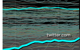
If you search for a domain you are interested in, it automatically gets added to the graph. Hopefully, over time, a large number of domains will get added to it, and we’ll get an even bigger picture of site traffic on the Internets.
Domains searched within the last hour are rendered in brighter colors, and gradually fade, so you can see what people are interested in.
I changed the coloring in this graph from the one shown in the previous post: red lines now indicate sites which are losing traffic.
Enjoy!
