Mob Brown
According to a recent post in the Flickr Blog the ‘favorite’ color of the Flickr community is a warm brownish taupe. The blog points to a nifty application, favcol which computes the average color of all the images on Flickr recently tagged ‘favcol’.
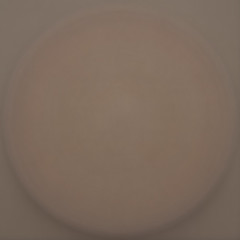
In actuality, that brownish taupe color is what you tend to get if you average any large collection of digital photographs, regardless of the source, and how they are tagged. I first noticed this early last year when I was working on mosaics, and then I *really* noticed it when I averaged a few thousand photographs of diverse circular objects (courtesy of the squared circle group on Flickr) and got this:
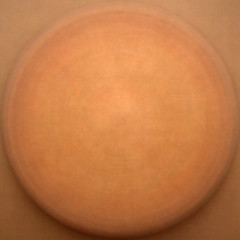
If I crank up the contrast, the result looks like this “bronze shield”:
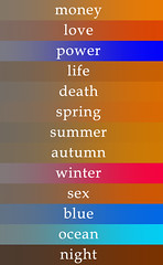
Shortly afterwards, I computed the average color of a few thousand images which correspond to specific words, and produced this image:
The color on the left side of each word is the average color (which is usually brownish) and the color on the right side is the same color with the saturation cranked up (which is mostly orange). The exceptions were discussed in the thread – mostly due to small sampling size or tags that produce more uniform color.
I believe this is a well known phenomenon among folks who work with a lot of digital images.
The reason the color is so dull is because you are averaging a bunch of images which contain disparate colors. When you average opposite colors together, the result tends to be medium gray (#808080 or #7F7F7F). Because the red, green and blue components all average to the same value, like so:
|
|
||
|
|
||
|
|
So, if the color distribution were truly random, the average color would be gray, not brown.
What we’re actually seeing is a slight red shift (and an even slighter green shift). The ‘favcol’ color shown on the flickr blog is #736a64 or
|
|
||
|
|
||
|
|
and the color of my bronze shield from a year ago is around #847161 or
|
|
||
|
|
||
|
|
I suggest we formally name these brown colors that we commonly see when we average the colors. My suggestion is: “Mob brown”. Mob is a backronym which stands for “Mean of Billions”? Another name I thought might be cute is “Brownian orange.”
[ EDIT: More recently I’ve started using the label “Emergent Orange” 12-5-2013 ]
I have participated in a few discussion threads which discuss the brown/orange shift (here’s one, here’s another), and I will offer a few possible theories as to why we are seeing it.
Theory 1.
Most of the stuff we photograph (with the exception of the sky) isn’t blue.
I have a related theory, which might explain why our retinas are not sensitive to blue: must of the stuff that is interesting to monkeys (or whatever you call our biological ancestors) isn’t blue. Our eyes are most sensitive to green. This would be a desirable trait for a vegetarian critter that evolved in a verdant area.
However, in our modern life there is less green stuff than in our monkey life. Thus the red shift. We plaintively wish for a return to the green shift.
Theory 2.
Digital cameras tend towards “warm” colors – they are designed by the manufacturers to do this, because they are mimicking the way film used to work, or because “cold” pictures look creepy. I don’t know if this is true, but it appeals to me. Kind of like all those happy endings that movie studios tack onto the end of movies.
Theory 3.
A lot of photos are taken in artificial light, or with the use of flash, and the colors in those photos correspond to the spectra of those lights. Many folks with cameras never figure out how to turn the flash off.
Theory 4.
The sun is a hot yellow star. It is unreasonable to assume that things lit by it would have evenly distributed colors.
Theory 5.
Orange is the color of life. Also, it is the color of Florida orange juice.
Theory 6.
People like to photograph Buddhist monks, because they have pretty orange robes. Any statistically random collection of photos will contain at least a few photos of Buddhist monks. The robes tilt the balance. Especially if the monks are fat.
Theory 7.
Harry Knowles.
Theory 8.
Theodore Sturgeon said that “90% of everything is crap.” Thus the brown.
Actually Sturgeon might not have said exactly that. But that just proves his point.
Got any more theories? Let me know.


March 26th, 2006 at 1:41 am
you can call our common ancestor with chimpanzees “australopithecus afarensis” aka Lucy.
Love,
Your Daughter
April 10th, 2006 at 2:48 pm
A real-world example here: http://www.flickr.com/photos/getthebubbles/89359058/
May 4th, 2006 at 12:51 am
Your discussion on this color is somewhat reminiscent of an issue that was studied on a wider scale in 2002.
http://antwrp.gsfc.nasa.gov/apod/ap020702.html
October 30th, 2006 at 9:04 am
[…] Bumgardner’s Law: Any sufficiently large collection of photos must contain at least a few Buddhist monks. […]
August 6th, 2009 at 7:42 pm
[…] I’ve been doing some new research on the “MOB Brown” or “Orange Shift” phenomenon I first blogged about back in 2006. […]