Pants-rank: Comparing Apples, Oranges with Google Trends
I was recently talking to another puzzle maven, and the subject of how I measure the demand for specific logic puzzles came up. I’m interested in puzzle demand because it helps inform the choices I make when I add new puzzles to the website. It occurred to me that my methods may not be as widely employed as I had assumed, and it might be worth sharing them. This technique is not just useful for measuring demand for puzzles, but I’ll use puzzles as an example.
If you’re interested in measuring demand, you probably know that Google has a free service called Google Trends which allows you to measure comparative search volume for multiple search terms. One can debate how much Google search-engine demand correlates to “actual” demand (whatever that is), but it seems to me like a reasonable quantifier that is likely correlated (and is simple and easy to obtain). For the rest of the article, I will often use the word “demand” as a placeholder for “Google Search Traffic”.
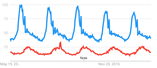
For example, here’s a chart comparing apples (blue) and oranges (red). Notice there’s a big bump on searches for Apples in the Fall, when they are presumably in season (or maybe people are buying iPhones? I don’t know…).
If I extend the chart over a 5 year period, I can see that the demand for apples and oranges follows a cyclical seasonal pattern – a common phenomenon with many search terms. Apples are popular in the Fall, and oranges in the Winter.
As you can see from these charts, Google doesn’t reveal actual search volume, it only shows relative search volume, which it always maps to a scale from 0-100. Because the numbers are presented as rounded integers, it is not particularly helpful to compare two search terms in which one has 100 times more traffic, because the smaller item will get scaled down to the 0-1 range, which isn’t very informative. For example, if I compare Sudoku (blue) with Slitherink (red), I can’t really learn much about Slitherlink, other than that its search traffic is < 1% of Sudoku, which doesn’t tell me much.
It would be cool if there was a way to measure relative demand for a group of items where several magnitudes separate the most desired from the least desired items. As it happens, there is.
So my “one weird trick” is to use a small stable search term as a baseline (I call this kind of system “pants-rank” for reasons that will soon be clear). Recently, I’ve been using Futoshiki, a relatively unpopular Japanese logic puzzle, as a baseline for measuring search demand for other logic puzzles. So I measure puzzle demand in “F-Units” (or futoshikis, in which the demand for Futoshiki is normalized to 1. So for measuring puzzle demand, Futoshikis are my “inch”.
Here’s the demand for Futoshiki (blue) and Slitherlink (red), two puzzles with similar demand.
On the real chart, if you hover over the “average” bars on the left, you get two integers (again scaled to 0-100) which indicate that Futoshiki has an average relative demand of 61 and Slitherlink has 38.
 So the F-units of Futoshiki are 1 (by definition) and the F-units of Slitherlink are 38/61 (or .62). I can then work my way up to successively more popular puzzles, and work out the F-units for Kakuro (5.38) and Kenken (8.77). Eventually the scaling for Futoshiki becomes too small, so instead I use a known puzzle whose F-Units I’ve already determined as a baseline for measuring more popular puzzles like Sudoku and Crosswords. Using this technique, I’ve worked out that Sudoku demand is at approximately 395 F-units and Crosswords are at a whopping 857 F-units. Here’s a table showing F-Units for a number of puzzles I’m interested in.
For what it’s worth, the demand indicated by Google Trends does not necessarily match the demand for puzzles that I see on my website. This is because other factors come into play, like how well I’m ranked on Search Engines, puzzle scarcity, and other intangibles. For example, Suguru is a very popular puzzle on my site, for some reason (in the KenKen/Kakuro range), but doesn’t seem to be hugely popular on Google.
In the past I’ve used this same trick to measure many other non-puzzly things. When I first did this, I used “pants” as my baseline (another fairly stable search term that has a slight bump in the late Fall preceding Christmas), and used them to measure celebrity popularity in “P-Units” (Pants-units). Hence “pants-rank”. “Chairs” is actually a more stable unit as it is less prone to seasonal fluctuations. Here, for example, is Lady Gaga (blue) compared to pants (red) and chairs (yellow) for the past 5 years. The spikes likely correspond to album releases and TV appearances.
I can see that Lady Gaga has been averaging 0.43 P-units and 1.11 C-units over this period (and I also happen to know she is about 435 Futoshikis – about Sudoku level, but not quite Crossword level popularity. But who is, really?


